
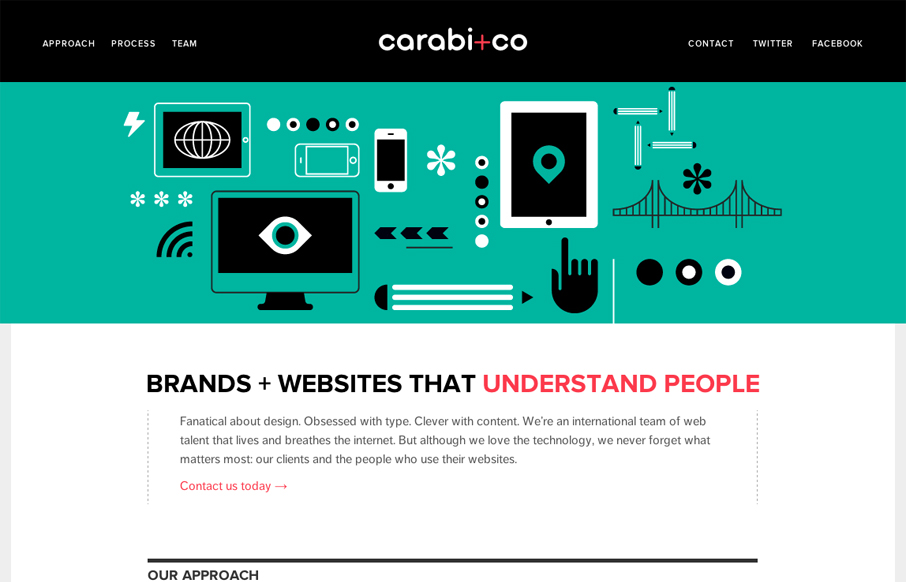
Nice use of illustrations to help tell the story of what you do. Nice limited color palette of black, green & a little red. It keeps it simple overall while still having some slightly busy illustrations. I especially like the header, the fixed header that gets a little thinner as you scroll down really helps to show that it’s there for the visitor. Nice touch.


Fitts’s Law: Why the Easy Button Wins
Large, close targets are faster to hit than small, distant ones, that’s Fitts’s Law. A look at the 1954 rule behind buttons, prime and magic pixels, thumb zones, and dark patterns.


0 Comments