capitol-college.edu

capitol-collegeedu

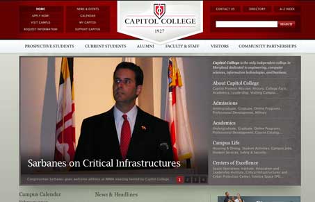
We don’t feature a lot of university websites on UMS, not sure why, maybe it’s that a lot of them are just huge and feel cumbersom to review. Not this one!

I really like the header area of this website, the navigation is broken into three distinct sections and it’s easy to take in. The roll-over states are simple and understated. The logo treatment in the large upside down triangle shape really drives your eyes right down into the page, that’s well done and well placed.
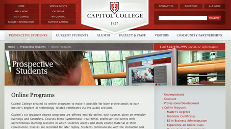
subpage-capitol

The sub pages are really a standard fare type layout, but I love the section images – especially how there’s always a little element that pops up out of the image’s box, that’s a really nice little touch.

1 Comment

  1. Web Tasar?m

    Good universty design.

    Reply

Submit a Comment

Your email address will not be published. Required fields are marked *

News & Articles

Sign-Up: Enhancing Conversions through good UX

Sign-Up: Enhancing Conversions through good UX

Optimize your website’s sign-up process by focusing on clarity, ease, and user mindset. Clearly explain the purpose, benefits, and steps, and use social proof to build trust and drive conversions.

The Essential Guide to Getting Started on Freelance Writing

The Essential Guide to Getting Started on Freelance Writing

Explore the lucrative and fulfilling world of freelance writing with our essential guide. Learn about specialties like blogging, social media, article, and technical writing. Build a portfolio, find work, set up your business, and discover the potential earnings. Embrace the freedom of working from home and follow tips for success in your dream career.