
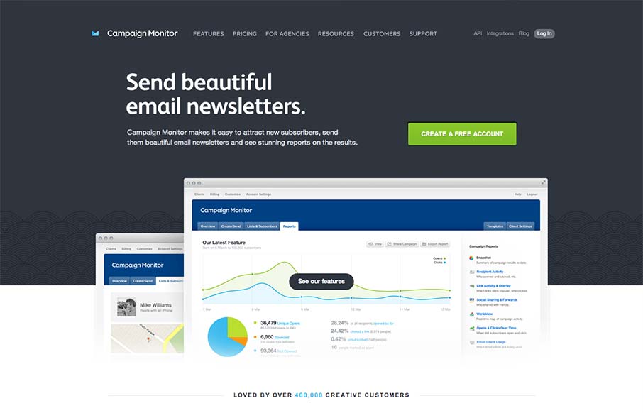
Such a great clean and clear experience. I love the overall simple approach, keeping the visual noise to a minimum, it’s totally different in approach to most product websites like this. The call to action is super clear and concise but doesn’t beat you over the head either. Check out the newsletter signup interaction design in the footer area too, superb.


Fitts’s Law: Why the Easy Button Wins
Large, close targets are faster to hit than small, distant ones, that’s Fitts’s Law. A look at the 1954 rule behind buttons, prime and magic pixels, thumb zones, and dark patterns.


0 Comments