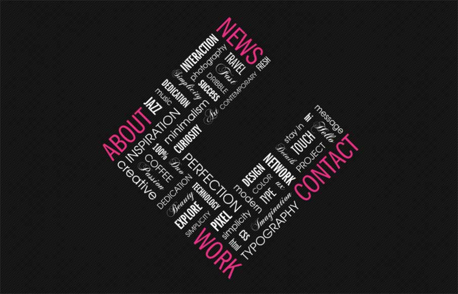
Cool and different agency site out of Croatia for C2 – Ana and Sergej. Really enjoyed the opening sequence that turns into your initial navigation with the block C. Also like the use of the slider, plus side scrolling in the Work section. Finally – I like the integration of the social media feed (plus side scroller again) of the News section, to take over a normal blog feed (that all of our clients ask for, and none use) – it’s smart and timely.
Glassmorphism: The Transparent Design Trend That Refuses to Fade
Glassmorphism brings transparency, depth, and light back into modern UI. Learn how this “frosted glass” design trend enhances hierarchy, focus, and atmosphere, plus how to implement it in CSS responsibly.


Thanks for the review and for the kind words Aaron! Really glad you liked our new website. We wouldn’t call ourselves an agency though, we are just a freelance creative duo.
No worries Sergej – sometimes freelance work trumps agency work because in the end – you’re still free