brianhoff.net

brianhoffnet

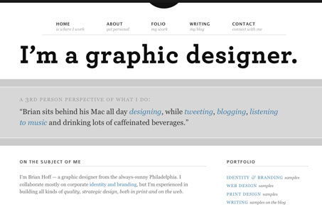
I love the simple typographical statement of this design. The large header type is beautiful and the layout and simple accent shapes make this design come together. It’s a little odd that the portfolio goes to another site like it does, but I suppose it works.


brianhoffnet

I love the simple typographical statement of this design. The large header type is beautiful and the layout and simple accent shapes make this design come together. It’s a little odd that the portfolio goes to another site like it does, but I suppose it works.

Kinsta

1 Comment

  1. John

    Archer FTW

    Reply

Submit a Comment

Your email address will not be published. Required fields are marked *

Time limit exceeded. Please complete the captcha once again.

News & Articles

Fitts’s Law: Why the Easy Button Wins

Fitts’s Law: Why the Easy Button Wins

Large, close targets are faster to hit than small, distant ones, that’s Fitts’s Law. A look at the 1954 rule behind buttons, prime and magic pixels, thumb zones, and dark patterns.

The Call to Action, Revisited

The Call to Action, Revisited

The Call to Action hasn’t changed in a decade, but the bar has. A fresh look at prominence, copy, mobile tap targets, and accessibility, with lessons from three major design systems.
