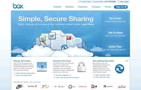
Pretty straight forward webapp website, but I love the slick looking icons, that’s what really sells the overall experience for me. The other thing I note on this website is that there really is a ton of information/content throughout. It’s the information architecture that makes it so easy to take in and navigate. I always marvel at how some very talented IA’s can make a pretty expansive website seem easy to digest and not quite so deep that it overwhelms you.
One other very interesting design aspect to this website is the signup page.:
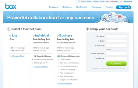
I really like how they have the pre-purchase “decision making” information on the same page as the form, and they’ve kept the form small enough to all fit on the same page. The other accommodating design addition here that sticks out to me, is that you can click on the entire plan description area to select the radio button, then the signup form itself changes to fit the plan type.


0 Comments