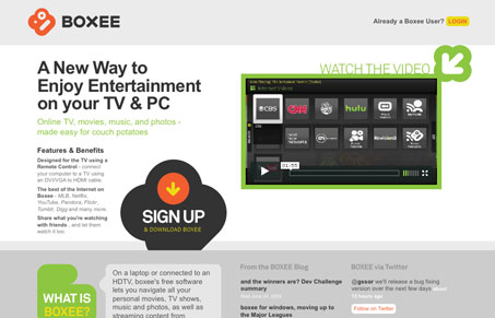
The new(ish) site for Boxee, I just love it. The design is very clean and has a couple of really clear calls-to-action. The typography isn’t as clean and neat as it could be, it’s actually quite difficult to read in places, particularly the “Features & Benefits” paragraphs. Overall I really love the feel of this website, it’s subtle yet very obvious and even loud graphically in places. It’s almost everything I love to look at on a website. Plus Boxee rocks…
Glassmorphism: The Transparent Design Trend That Refuses to Fade
Glassmorphism brings transparency, depth, and light back into modern UI. Learn how this “frosted glass” design trend enhances hierarchy, focus, and atmosphere, plus how to implement it in CSS responsibly.


0 Comments