Boomerang Communications

http://www.weareboomerang.com/

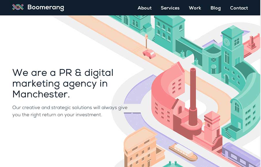
The visual style of this site is really slick. I love the colors and vector icon work as well as that main illustration/animation of the factory. Smart, smart work here. Event the pictures have been color corrected to fit into the overall colors of the page, subtle, small details make this site sing.

Submitted by: Katy Cowan @teamboomerang
Role: PR and digital marketing agency

We’re a small yet growing agency in Manchester and we worked collaboratively with freelance designer Jonathan Shackleton to create our new brand identity and website design. More details can be found here: http://www.weareboomerang.com/blog/boomerang-launches-its-new-brand-identity/
Thanks for your consideration.

0 Comments

Submit a Comment

Your email address will not be published. Required fields are marked *

News & Articles

Sign-Up: Enhancing Conversions through good UX

Sign-Up: Enhancing Conversions through good UX

Optimize your website’s sign-up process by focusing on clarity, ease, and user mindset. Clearly explain the purpose, benefits, and steps, and use social proof to build trust and drive conversions.

The Essential Guide to Getting Started on Freelance Writing

The Essential Guide to Getting Started on Freelance Writing

Explore the lucrative and fulfilling world of freelance writing with our essential guide. Learn about specialties like blogging, social media, article, and technical writing. Build a portfolio, find work, set up your business, and discover the potential earnings. Embrace the freedom of working from home and follow tips for success in your dream career.