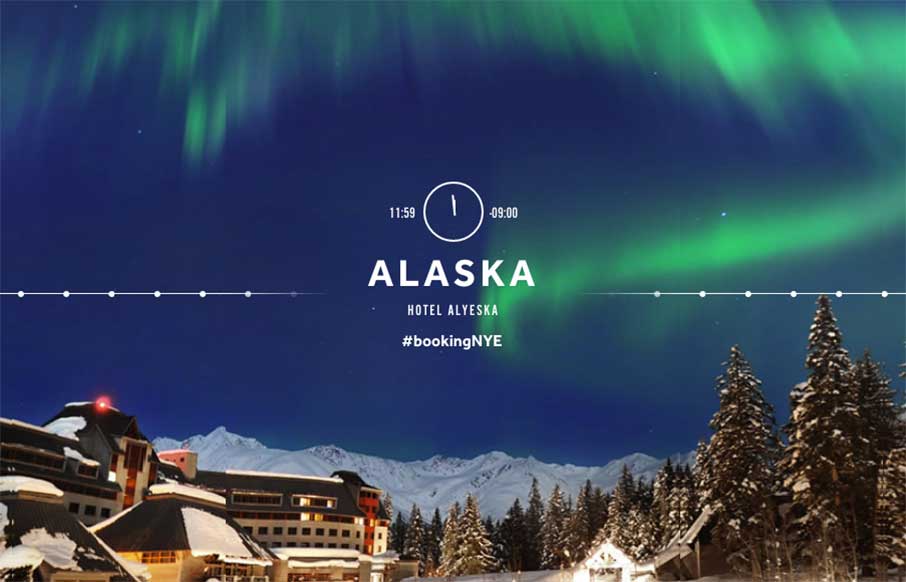
I’m sorry I saw this site a little too late for the contest, but Booking.com‘s 11:59 NYE site on it’s own merits is a pretty cool microsite / landing page(s). In the site, you get to: “Explore 24 time zones, showcasing the world’s most beautiful locations to find your perfect 11:59 moment for New Years’ Eve 2015.” Their business is to sell tickets and hotel rooms, but what they want you to envision is the experience you get from visiting these places – and this is an excellent vehicle / site to do that with. In essence, it’s a slideshow, with movement based on mouse position, and almost a kind of sideways parallax – that all ties into destination locations on their regular site. If you’re going to make a landing page for something, that leads into the rest of your site – make it good – Booking.com did that.
We’re pretty stoked to have Booking.com‘s UX Designer, Zoe Mickley Gillenwater (@zomigi) coming to ConvergeSE in April.


0 Comments