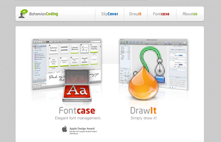
This is one of those really strong illustrative/icon driven type websites. The home page is working like a simple splash page almost, just shoveling you off to one of the product pages/sections. I think it’s working pretty good here since the icon design is so strong. The overall design is very tight and well executed. I love all these details and that’s something you’ve just got to do, even more so, when you’re selling software. Great job here.
Glassmorphism: The Transparent Design Trend That Refuses to Fade
Glassmorphism brings transparency, depth, and light back into modern UI. Learn how this “frosted glass” design trend enhances hierarchy, focus, and atmosphere, plus how to implement it in CSS responsibly.


0 Comments