Via @Squaredeye
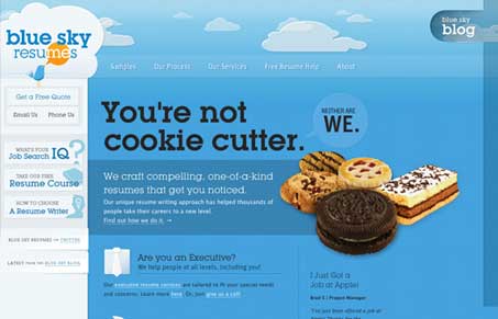
We proudly present you with http://blueskyresumes.com. A collaborative work of (@squaredeye @gregpash @emilysmith @seangaffney @ticjones)
This website is full of detail and craft I wasn’t able to really capture it in one of our short screen cast reviews. Instead I’d like to focus on just a few things that I like most about the design. First off the level of detail work is immaculate, that’s kind of a staple of Squaredeye designed sites, we’ve come to expect it.
As you go from page to page you see that everything has been designed, there’s not really any repeated template types for the pages (if there is, I didn’t notice it) each page has been given time and has been visually developed to tell it’s particular story well. There are plenty of little interactive elements across the breadth of the site that we can all study and steal learn from, my favorites have to be the detail work on the various form elements.
Overall it’s a great website design, chock full of detail and I urge everyone to go spend some time with this site and see what you like and can pull out for yourselves.


First, I would agree with the comments on the designs being immensely immaculate. Many kudos to the designers on such an awesomely amazing level of detail. Beautiful work.
I was interested to see this in IE6, as I knew it would have major issues, and I can see they chose to not support it by forcing the upgrade. I would have to say good call there. I was disappointed, however, on IE7. The fonts are pretty bad for me. I hope it is an isolated issue. If not, I think it is a bit of a problem, especially on some of the buttons, etc. where the IE7 text fails to even be readable.
Overall amazing design and incredibly cool site.
Thanks for the kind review guys. It was a challenging site to build with a ton of new technologies and lots of detail. Glad we brought it to bare on the web 🙂
I can imagine! I’m still sorting through all the little details you put into this thing.