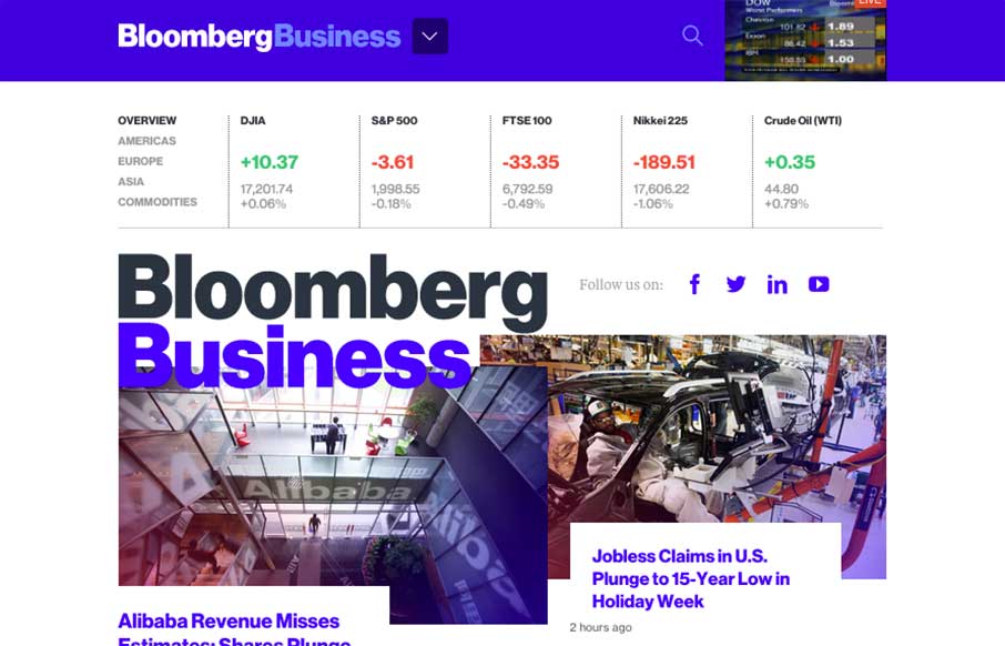
I just mentioned to Gene that I don’t even know where to start on this site review. Brad Weaver’s tweet (below) kind of says it all of Bloomberg’s (@business) new website – gorgeous and usable.
There’s already been so much praise and controversy over this new site design since it launched earlier this week. All of it has a lot to do with perspective probably – if you’re more from the financial world (Bloomberg’s customer base), you’re probably a little freaked out. (Kind of like the new BMW commercial with Katie Couric and Bryant Gumble about Internet)
If you’re from the design world like us, you might be thinking, “finally”. Finally a large media company is taking another big step in design, in line with current (and future?) trends. Just like the Boston Globe (@BostonGlobe) did with Ethan Marcotte (@beep) in 2010 with responsive web design (RWD), Bloomberg, with CEO Justin B. Smith (@Justin_B_Smith), gave the power to Joshua Topolsky (@joshuatopolsky) to dynamically change the design of a major player in the media world. Time will tell if this way of designing enterprise level sites will catch on like RWD.
Found a good article for more background and reactions to the new Bloomberg site here from NiemanLab, by Caroline O’Donovan.
Yeah – the site is loud, but I think like any good site, it has “calls to action” – you just get to decide what those are.
First – the sticky header: This is genius – the live feed of Bloomberg Business TV in a size that doesn’t kill the usability / speed of the rest of the site.
Next – The headlines: Most good headlines that editors put on stories have two parts – the main headline that grabs attention, and the subheadline that explains or is a quick intro to the story. Really like how the hover state for a main headline is the subheadline, it adds some punch in the “reveal”.
Finally (not the last thing on the site – animated gifs, card /block design, parallax, responsive design, and mega-dropdowns should also be noted) – The article detail pages: Took me a couple of times to learn what was going on, but now makes sense. The article pages are toned down from the front page – they know you want to concentrate on reading now. There are two caveats to that – first being the infinite scroll of the articles – there’s related story and advertising buffer, but why not keep reading as you scroll down forever (wonder where it stops?). Second is the article status bar just under the sticky header, and the “Now Reading:…” copy in the header. It’s nice to have something that lets you know when you’ll be done reading the article (if pressed for time), and with the infinite scroll, getting lost could be normal – this status bar and the “Now Reading” is a little way to stay on the map in a never-ending content environment.
Kudos Joshua Topolsky and your team – way to push some barriers in the design world!
The new Bloomberg site design is freaking gorgeous and easily usable. Kudos to the UX and visual teams involved. http://t.co/b5ovqutu8O
— Brad Weaver (@sbradweaver) January 29, 2015


Great review with some useful links – thanks. I can’t decide if this is genius or madness!