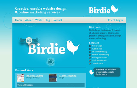
What a nice design. The little birdie is similar to the twitter one, but not so much so it’s valid as a ripoff. It seems unique enough in it’s design to me.
What a nice design. The little birdie is similar to the twitter one, but not so much so it’s valid as a ripoff. It seems unique enough in it’s design to me.


The Call to Action hasn’t changed in a decade, but the bar has. A fresh look at prominence, copy, mobile tap targets, and accessibility, with lessons from three major design systems.

Glassmorphism brings transparency, depth, and light back into modern UI. Learn how this “frosted glass” design trend enhances hierarchy, focus, and atmosphere, plus how to implement it in CSS responsibly.

Brutalism in web design rejects perfection for authenticity. Stark grids, raw type, and honest structure create interfaces that feel human, intentional, and impossible to ignore. Break the rules, on purpose.
Thanks very much! I’ve had a few people mention the twitter bird thing, and it’s discussed in detail on my blog, i’d love to hear what you think.
http://www.bird.ie/blog/the-birdie-brand-and-the-twitter-bird
Cheers,
Cormac
We’ve seen a lot of rip-off designs come through our site and other gallery sites, we look at a lot of sites, trust me. This logo is not in my book a rip. The only similarity is that they are both birds, that’s like saying Kellogg ripped off Exxon to create Tony the Tiger…