
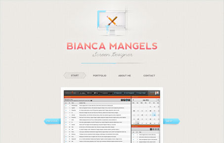
When a designer puts thought from all angles into something for themselves, you get really good results like this. I love the concept of pencil draft and slick graphics harmonizing together. Bianca managed to pull this off with just the right amount of love to each. She paid attention to details without going overboard. I like that the site still retains a simple feel even with a few of the little fancies that she added like the interactive brain and other subtle animations. The portfolio screenshots are a great size, though I wish there was some kind of dark transparent background behind the modal after you click on “Original Size.” All in all this was a really fun and creative site to poke around. Well done!




0 Comments