Found via @AIGASC
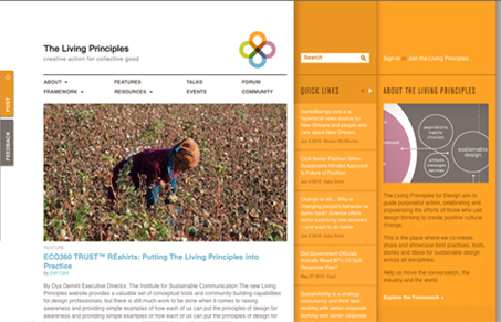
Just In! The beta site of the Living Principles is live. Check it out & join the conversation beta.livingprinciples.org
This is a pretty cool looking layout at first. I like the orange sidebar(s) in contrast with the normal white background that holds most of the content. I also really like the hierarchy used in the main large image placed over the smaller images used for older posts.
Two particular parts of the site I feel that could be made to have more impact is the header and footer. The header is debatable, even in my own mind, but it’s worth mentioning the logo area and navigation are lacking some much needed character. Then the footer area is pretty much weak visually. I’d love to see a much stronger and darker footer area – that’s just my opinion.


i agree that the header needs work, specifically the main navigation. it is pretty much unusable with the stacked drop downs. if you want to go from “About” to “Framework” for instance, you need to mouse out to the left or right first…design looks nice though, it just needs some work.
Totally agree Matt, the interaction design just isn’t there, but the rest of the design is pretty dang good.