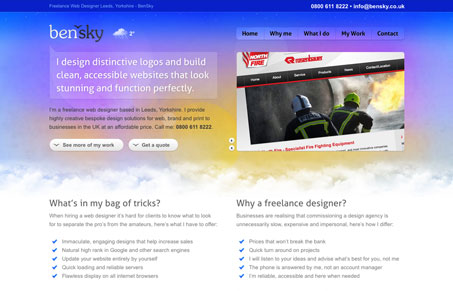
I especially like the various detailed elements on this website. The buttons are all consistently designed up and there’s little interactions everywhere that you can uncover. I really like the quotes/testimonials interactions in the footer area. Normally I don’t like hiding content by default but that’s a decent way to do that and still give a peek at the content. I also really love the selection design for the portfolio section and the web form fields all a nice touch on a really good website.
Glassmorphism: The Transparent Design Trend That Refuses to Fade
Glassmorphism brings transparency, depth, and light back into modern UI. Learn how this “frosted glass” design trend enhances hierarchy, focus, and atmosphere, plus how to implement it in CSS responsibly.


0 Comments