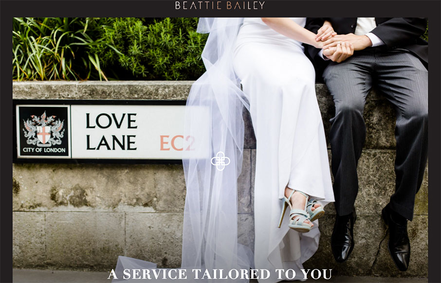
I think we would have replaced our wedding planner with Beattie Bailey (out of London), just based on their website. Love the framing of the site, the movement (from top to bottom, and in the logo), and the nav (how it starts in the footer, and moves up on scroll to click into place). It all has a great feel.
Glassmorphism: The Transparent Design Trend That Refuses to Fade
Glassmorphism brings transparency, depth, and light back into modern UI. Learn how this “frosted glass” design trend enhances hierarchy, focus, and atmosphere, plus how to implement it in CSS responsibly.


0 Comments