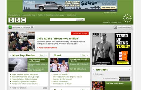
The new(ish) BBC website rollout is really interesting. I do like it, I like the ability to customize what I want on the page. The fold up panels are very well done. The entire design is modular and has some great detail all over it. There’s a ton of information to be conveyed on this page and the design handles it with ease and at no point do I feel overwhelmed by the content. That clock is really neat too. Great, great design here.
Glassmorphism: The Transparent Design Trend That Refuses to Fade
Glassmorphism brings transparency, depth, and light back into modern UI. Learn how this “frosted glass” design trend enhances hierarchy, focus, and atmosphere, plus how to implement it in CSS responsibly.


Its a pity you get the adverts, in the UK there is no advertising on the site so it is a lot cleaner.
Didn’t know the BBC did ads outside of the UK. No reason why i should do I guess browsing it from here.
I remember when this came out about a year or two ago now, absolutely fantastic, definitely one of my favourite portal designs among the many I’ve encountered. The BBC are generally very accomplished, you just have to look at the subsites such as Doctor Who’s to see the talent they’re harbouring. Definitely an ambition to work there.
The BBC are very accomplished. But I think you’ll find a lot of their websites are made externally by independant companies such as Preloaded and Magnetic North. Great work nonetheless!