
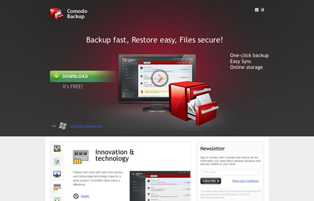
Nice looking product based website design. Even though I think it gets a bit convoluted as you scroll down the home page, it still communicates efficiently before you experience that. The main section, above the fold, has a clear call to action and explanation of the product. There are also a lot of slick looking icons and type to back up the product in communicating that the software is trustworthy before you download it.




0 Comments