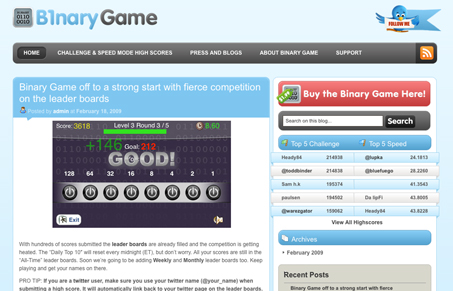
Pretty neat site for an iPhone app. I’m relieve that it’s not just another one page site with a big picture of the app inside an iPhone picture. It’s different. Good colors and keeping it almost a pure blog seems simple but also a strong strategy for keeping it fresh. It seems to fall apart at the very bottom of the page with the footer, but I can really overlook that given the rest of the design.
Glassmorphism: The Transparent Design Trend That Refuses to Fade
Glassmorphism brings transparency, depth, and light back into modern UI. Learn how this “frosted glass” design trend enhances hierarchy, focus, and atmosphere, plus how to implement it in CSS responsibly.


0 Comments