
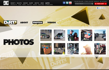
Pretty crazy layout with the diagonal sided nav elements and the large background image. The colors add greatly to the wild feeling of the design, but the structure is actually quite simple. That’s cool to me, when you start with something that’s almost minimal and clean and the stuff on top of it to make it crazy looking.




0 Comments