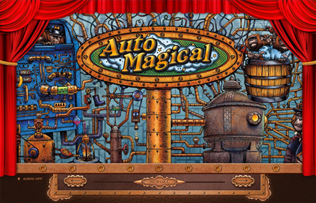
This site is just crazy. It’s incredibly simple in what it does, and clearly the illustration is what drives it. But, man it’s awesome… I love illustration like this, and I really love it when it’s used to totally make a concept cool. It’s a splash page for mailchimp’s automagical service, so the site is fairly one dimensional in what in needs to do, but they’ve created a genuinely interesting and creative concept to drive you to the mail site to convert. Brilliant!
Glassmorphism: The Transparent Design Trend That Refuses to Fade
Glassmorphism brings transparency, depth, and light back into modern UI. Learn how this “frosted glass” design trend enhances hierarchy, focus, and atmosphere, plus how to implement it in CSS responsibly.


0 Comments