
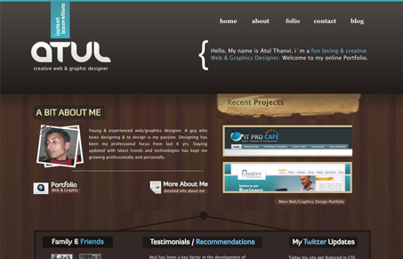
This design has an interesting feel to it. The large “over-sized” header and the misc real world feeling elements make it stand out as I look over a big list of websites. The colors and graphics are pleasing and make you want to look deeper, which isn’t as impressive when I discovered several of the details weren’t click-able or links didn’t lead anywhere. Clean those things up and you’ll truly have a great website on your hands.


Fitts’s Law: Why the Easy Button Wins
Large, close targets are faster to hit than small, distant ones, that’s Fitts’s Law. A look at the 1954 rule behind buttons, prime and magic pixels, thumb zones, and dark patterns.


Actually this website is still not done with content part because of my busy schedule.
Thanks for including my site here.