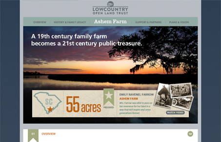
This site combines a rigid structure and clean lines with just enough texture to keep it from being too sterile. The site works well in that it’s easy to take in whether the user decides to scroll down the page manually or by using the navigation. For single-page scroller type sites, this is important.
I’m not entirely sure about the use of Futura here, though. There’s a nice hierarchy and spacing to all of the type, but a sprinkling of a serif, or just something more friendly could help warm up a bit more.


0 Comments