
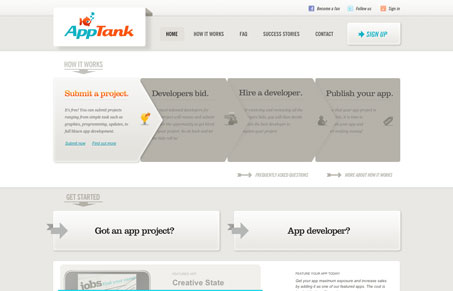
Nice clean design with some good interactions on the main elements. I don’t quite think the logo and the rest of the website match in tone fully but it works in the end. I especially like the main 4 step process visualization on the home page, the mouse overs are nice to check out and bring focus to the process.




What’s with all the arrows?
What would you prefer? I think the arrows show direction and the steps through the site