
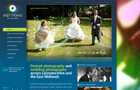
Great colors, great logo too. I love the huge photos for this photography portfolio website. This website is mapped out really well, it just seems to flow with it’s organization like I expect it to. The large background image that causes the browser to scroll seems troublesome to me, I can see where that might cause some issues for people.


Fitts’s Law: Why the Easy Button Wins
Large, close targets are faster to hit than small, distant ones, that’s Fitts’s Law. A look at the 1954 rule behind buttons, prime and magic pixels, thumb zones, and dark patterns.


It is a good site, but you’re right—the scroll is both annoying and unnecessary 🙁