
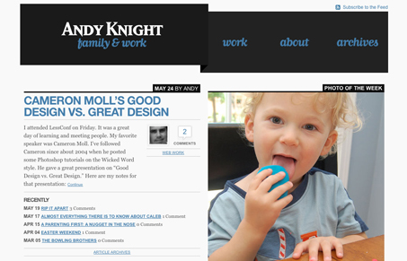
Love the oversized header design, it really keeps the design anchored well visually. The two column design is nice here, not only is it visually split but the content is split conceptually (at least slightly but still related to the page you’re on) as well. Really neat site, catch the screen cast review of it as well.




I appreciate the nice comments. I just nocticed this post and screen cast reviewp today as I was looking through my referral logs. Thank you very much.