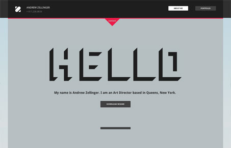
I like the simplicity of this site. There are just solid colors without any gradients or drop shadows and just the basic info about what Andrew does. And one way to make a good impression is to just show of your work and up in the top right is a portfolio link. Clicking on this brings up a list of screenshots of some really nice work. It would be nice to have some sort of navigation to jump to each different project but otherwise it’s good way to show them off. One problem I ran into, though, was that the portfolio didn’t work at all in Firefox (3.6). It may well work great in Firefox 4 and it does work fine in Safari/Chrome. However the fonts don’t seem to load quite right in Chrome. These are pretty common browsers so I would imagine that even older ones would have more issues. It’s just something to make sure you really test well across a range of browsers before releasing it into the wild.
Glassmorphism: The Transparent Design Trend That Refuses to Fade
Glassmorphism brings transparency, depth, and light back into modern UI. Learn how this “frosted glass” design trend enhances hierarchy, focus, and atmosphere, plus how to implement it in CSS responsibly.


It’s funny that they don’t load well in chrome, because they are google fonts, I was a TAD bit confused with that.
I also QA’d for FF 3.6 but now firefox will not support FF 3.6 seeing that FF 5 is out now. I did have trouble with those problems you pointed out, and I’m still working on those issues.
Thanks a bunch for the feedback, it helps out a lot!
Thanks for commenting, Chase! For what its worth, we’re still getting about 10% of our traffic on this site from FF3.6 versus about 14% in May. It’s definitely going down fast, but there’s still a lot of people using it.
Yes of course, the joys of standardization! Thanks again for the feedback & ups on the site. =]