
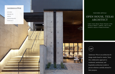
Anderssonwise.com has a nice unique and responsive layout. Imagery is used in a way that draws you in to an environment as opposed to just looking at pictures of it. A sophisticated restraint is used throughout the site to keep the focus simple, yet striking. Details such as limited content, a navigation that fades out, and overall lack of visual noise really make their work stand apart. Beautiful and precise.
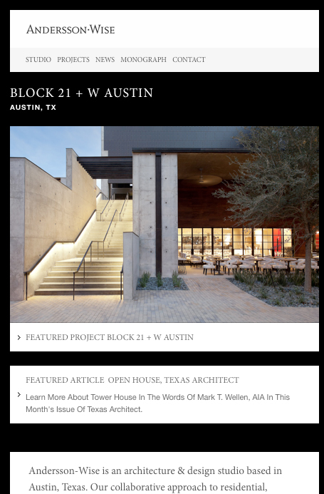




Love this site. It’s fancy and simple.