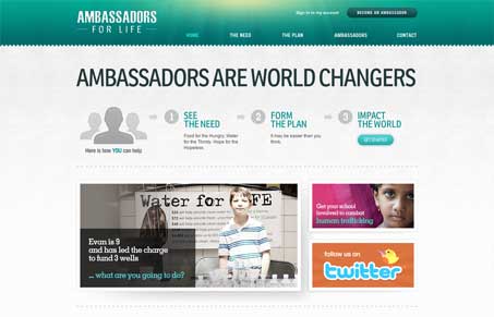
This is a really clean and well detailed website design. I also really dig the colors, the green and other earthy tones are chosen well to help communicate that ‘world’ vibe. The header confuses me visually a little bit, with the radial gradient overlaid with what comes off as rivets over metal. I could be off greatly on that but that’s what it looks a little like, wich is at odds with the earthy tone. Overall this site is well executed and has some nice detail work.


0 Comments