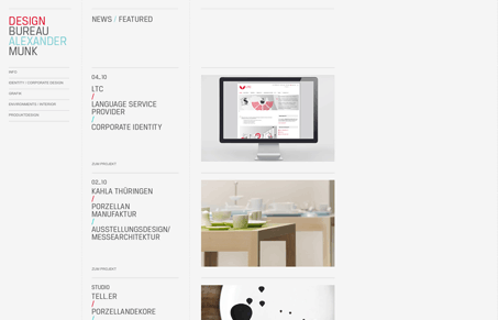
I’m loving the stark clean lines and minimal aspect to this design. Now I’ve seen this type of design/layout many times, but this one somehow comes off as looking fresh to me. Maybe it’s the red and teal colors together in the small amounts or that particular typeface that’s being used. But it’s well done and I liked coming across this design.


0 Comments