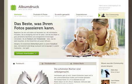
So this site definitely doesn’t break any new ground. It has a couple of the elements of recent design trends like Museo (I’ll forgive anyone for using it, though, it’s such a beautiful typeface) for titles and a ‘ribbon’ element. Still, this is a very well designed and executed site. It’s also very deep, dig around and you’ll stumble upon (I say stumble because I can’t read a lick of German) a whole community site. The design does start to fall apart a bit on the community, perhaps this is due to integration in a pre-existing app.
There are a couple of small elements that I think could make this site a little sharper that have little to do with design. The main navigation elements have some sort of drop shadow and the effect results in a decrease in sharpness of the text, whereas text elsewhere set in Museo is really crisp. Also, it appears that many of the images are blurry. I’m not sure whether this is due to enlargement or over-compression. but if they were a little sharper it would really add to the overall look of the site.


another site with museo :), i think so, so many elements here are blurry
Nice site. But it requires some corrections if it is made then it will be really nice.