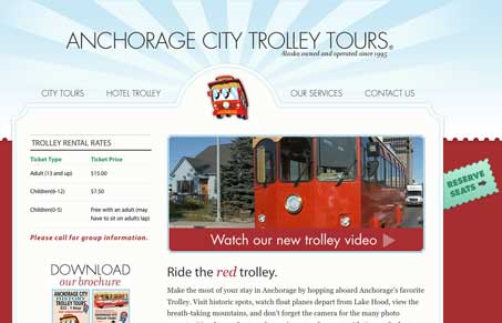
I like the look of this website design, it’s inviting and really puts forward all the important info you’d be looking for on the home page then let’s you dig into it within the sub pages – simply said I know but that’s not always easy to do. I like the colors and the header area design. The navigation uses three weights of the same typeface to tell you when you mouse over, click on and have the target page loaded. This is a cool concept and very subtle. I’m not wild about the movement of the type on mouse-over, that happens when you use different weights of certain typefaces but the concept is pretty cool.
Glassmorphism: The Transparent Design Trend That Refuses to Fade
Glassmorphism brings transparency, depth, and light back into modern UI. Learn how this “frosted glass” design trend enhances hierarchy, focus, and atmosphere, plus how to implement it in CSS responsibly.


0 Comments