Submitted by: René Keller @alalog
Role: Designer & Developer
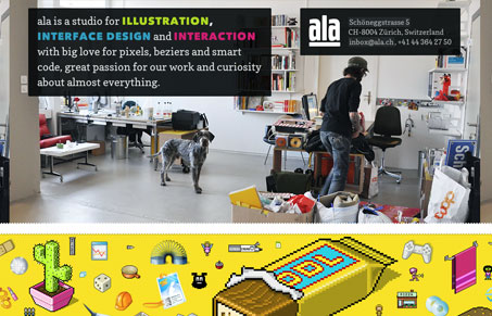
ala.ch is a studio for illustration, screen design and interaction with big love for pixels, beziers and smart code, great passion for our work and curiosity about almost everything.
ala.ch is a visual feast. Period. For the amount of action the site shows, it has littler interaction besides the many results of scrolling but the amount of movement gives ala.ch a dynamism that is generally lacking form template style designs. The fast and loose structure presents a visual collage of the skill set and design vision of the duo that make up ALA over any specific content. Its a design that seems to emphasize “variations on a theme” rather than rigid structure. I think this design will likely divide our audience into a couple camps: those that have some appreciation for the experimental nature of this site’s vision and those that hold to more traditional viewpoint about what makes good design.
For the most part, I’m in the first camp but I can certainly see the other side of the coin. Let us know what side you fall on. We’d love to hear your opinions about this and any other design we review.


0 Comments