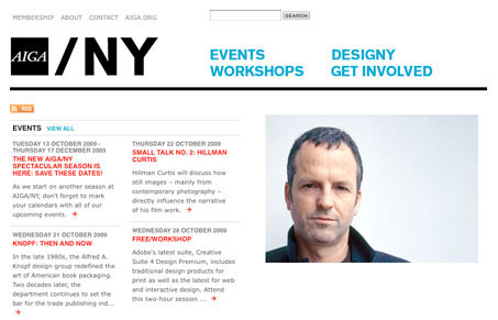
It might seem surprising that a national design organization website has such a minimal design, but it’s a great example of the KISS technique. This minimalist layout places more attention on the content, and the subtle background pattern around the blog excerpts creates a little differentiation between that section and the rest of the page. Simple, but effective.
Glassmorphism: The Transparent Design Trend That Refuses to Fade
Glassmorphism brings transparency, depth, and light back into modern UI. Learn how this “frosted glass” design trend enhances hierarchy, focus, and atmosphere, plus how to implement it in CSS responsibly.


0 Comments