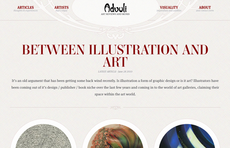
Holy cow I love the french art nouveau design details in this site. It’s really hard to do something like that and pull it off with a somewhat modern feel and this site does just that. This site is fairly simple in what it does and it’s interactions, it’s simply pushed ahead graphically with it’s style. It’s that style that grabs you and pulls you into the content for sure, you immediately get a sense for the writer’s aesthetic and know that you can expect to be shown a perspective on art that you haven’t encountered yet.

There are some subtle details in this site that are really nice, like the submit button on the contact page. It carries the site’s aesthetic to completion and it just makes me want to complete the form just for fun.
After digging a little deeper I see it’s designed by Yaron Schoen, and the writer of the blog is his wife. It would be cool to find out what it was like for them to work together…


I love this site… Yaron has the coolest submit, download and search buttons known to man.
I have mixed feelings about the construction of this site. At first glance it seemed a bit over ornate, kind of like a Persian rug. The navigation could have benefited from the use of subtle JQuery action, hiding the sub text and revealing it using a bubble-esque technique we see these days.
This site won me over with its use of typography, color, and nuance (the rollovers on the main images were amazing)
Yaron is the master of subtlety IMHO…
I have to agree with Trent on this one. Pretty amazing 🙂
Oh wow, just noticed you featured this. Thanks guys! I really appreciate the kind words.
@Gene I think that is a great idea you mentioned. I may just do a blog post about working together.
Totally Yaron, great work on this one. Would love to see that post too!