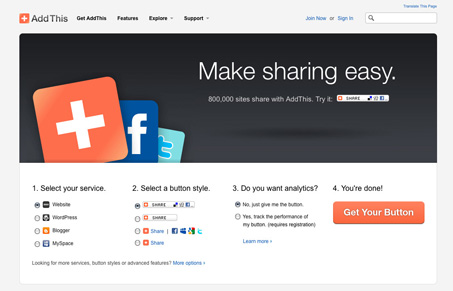
AddThis has been around a while and their recently got an update. It’s a really nice looking design, big image that helps sell it while being minimal at the same time, plenty of info as you scan down the page and it’s all displayed in a nice tight layout. There’s all sorts of great little details here and there on this design, from the fly-out navigation treatment in the header to the footer area across the site, it’s just a nicely done well executed minimal feeling design. I love it.
Glassmorphism: The Transparent Design Trend That Refuses to Fade
Glassmorphism brings transparency, depth, and light back into modern UI. Learn how this “frosted glass” design trend enhances hierarchy, focus, and atmosphere, plus how to implement it in CSS responsibly.


0 Comments