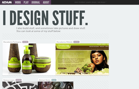
I like the typography choices in this design and also the colors and how they’re used together to make certain things stick out – like the header/nav area. I also like how the home page layout isn’t just centered or left aligned but almost staggered vertically down the page, it gives it an almost unique visual rhythm as you scroll down. I think the interactions are almost startling, but it all matches up well with interaction versus general design. It’s stark and bold and so are the interactions, so maybe it’s well played together.


0 Comments