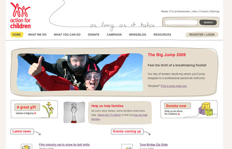
I love the hand drawn lines around each element on this site. They help give the page form on an otherwise boring background. I like how the red from the logo is used to highlight certain titles on the page. The hand drawn icons towards the bottom should be made links since people tend to click on those more than titles – I tried. The subpages and sub navigation are organized well and also continue the theme of the site.
Glassmorphism: The Transparent Design Trend That Refuses to Fade
Glassmorphism brings transparency, depth, and light back into modern UI. Learn how this “frosted glass” design trend enhances hierarchy, focus, and atmosphere, plus how to implement it in CSS responsibly.


Broken link. URL requires www. That’s such a fundamental mistake, it annoys me!
I’ve seen that so much for some reason lately. (sorry for not catching the link on the post here.) But, seriously this can be a pretty big problem for your website if you don’t setup DNS correctly.