
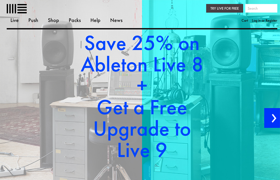
The product looks pretty awesome and so the website has to continue that same visual brand. Start black and angular type, minimal colors and crisp lines when there are any mark both the physical product and website. I like the way the slideshow loads when you first hit the site too.


Fitts’s Law: Why the Easy Button Wins
Large, close targets are faster to hit than small, distant ones, that’s Fitts’s Law. A look at the 1954 rule behind buttons, prime and magic pixels, thumb zones, and dark patterns.


0 Comments