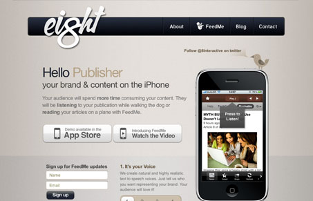
Nice looking iPhone app website. I like the big logo and the way all the elements share the same nice rounded corners. The Twitter bird/illustration is also fairly unique and it’s placement is rather clever – making it stand out so.
Glassmorphism: The Transparent Design Trend That Refuses to Fade
Glassmorphism brings transparency, depth, and light back into modern UI. Learn how this “frosted glass” design trend enhances hierarchy, focus, and atmosphere, plus how to implement it in CSS responsibly.


0 Comments