
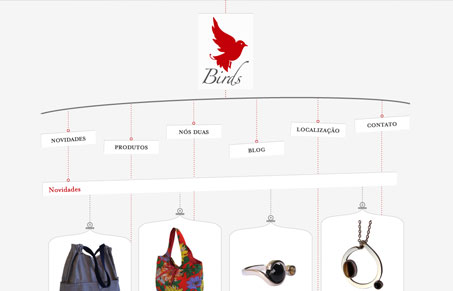
This site really pushes the limits of keeping the design withing a traditionally placed website navigation and I love that. It’s non-conformist yet the navigation is static on the page and the page uses the top-down scrolling that users are accustomed to. The hang-tag or mobile visual is pretty smart. The contact form at the bottom of the page is quite clever too.

Fitts’s Law: Why the Easy Button Wins
Large, close targets are faster to hit than small, distant ones, that’s Fitts’s Law. A look at the 1954 rule behind buttons, prime and magic pixels, thumb zones, and dark patterns.

Hey thanks for sharing this. I love seeing people’s creative thinking result in such an awesome piece of work. They did a good job!
Very unique concept, although the excecution is a bit confusing. It had taken me a while to realize that the “Novidades” section is a child of the “NOVIDADES” nav link and that the first 4 produt photos are children of the “Novidades” section. The fact that the section headings are missing their bottom borders makes them look disconnected from their child branches. Hence, the initial confusion for me. I think that the red dot above each section heading could be more conspicuous too.
Some usability issues for me are that the clickable areas for some of the nav links (i.e. “Produtos” and “Blog”) don’t extend down far enough, so hovering upon or just below the image-text doesn’t work. The scroll-down effect doesn’t work for these links either.
I’m not sure why the scroll-up button is on the left side of the page. Putting it on the right side would be convenient for people who habitually drag their scrollbars. Even though I use a scrollbar, I rest my cursor in the right third of the browser viewport anyway. Won’t someone think of users with huge monitors?
Otherwise the design is good.