
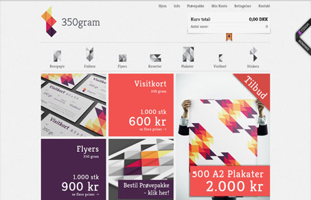
This is a really attractive and clever site. I don’t have to know the language to figure out what’s going on here. The creative “icons” and imagery inform as well as attract. The overall design is clean and crisp, but there’s still a tactile element that anyone who’s held, felt, or smelled a fresh new piece of paper would appreciate.




0 Comments