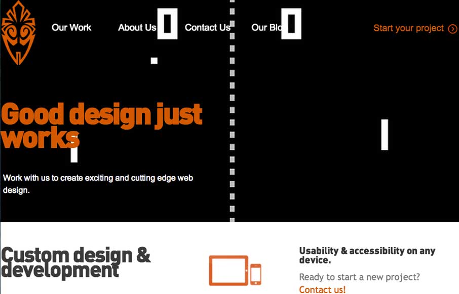
Overall the layout of 3 One Seven is intense visually. There’s blocks of imagery competing for your attention – which as I review this site appears to be the point of the design. It’s successful in that the images are actually compelling visually and the interactions intrigue me to do more. It’s a case of when I first looked at it I didn’t like it, but after using it, it really worked well for me.
4 CSS Features That Changed Everything
Over the past five years, a handful of new CSS features have completely reshaped how we build for the web. According to the 2025 State of CSS Survey, these are the true game-changers.


0 Comments