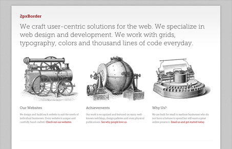
I really like the simplicity and understated quality of the 2pxborder.co.nz design. It lacks any main navigation and in most ways seems like its composed of the absolute bare essentials of what makes a useful site. However, this economy of design is the theme of the design and not a flaw. I love the fat borders and the fact that the site is responsive. But even here the use of responsiveness is simple, with only one break point. Theres little to complain about with this design (I do find the large block of sans-serif type hard to read) because there is little of anything to speak of, but what is there is done very well.
Glassmorphism: The Transparent Design Trend That Refuses to Fade
Glassmorphism brings transparency, depth, and light back into modern UI. Learn how this “frosted glass” design trend enhances hierarchy, focus, and atmosphere, plus how to implement it in CSS responsibly.


0 Comments