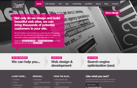
This is a pretty interesting looking site design, it’s using a picture of type as it’s background image with type overlaid on top of it, and they make it work! It’s clean and uses muted colors for the most part, which really make the calls to action links really pop out at you when they are in that pink/red color. Gio and I loved the sub pages, and the portfolio page design, you can see us go through them all in our screen cast review. Overall we both liked this website design and thought it was really effective.
Glassmorphism: The Transparent Design Trend That Refuses to Fade
Glassmorphism brings transparency, depth, and light back into modern UI. Learn how this “frosted glass” design trend enhances hierarchy, focus, and atmosphere, plus how to implement it in CSS responsibly.


Indeed this site kicks ass, not only is the wall graphics of the typography an awesome idea and execution, to photograph it and have it as branding on the website is genius!. Talk about a consistent look and feel!.
One of the biggest challenges a design studio has is to establish a “brand” for their business, What is the product? Its not the past work its what we can do, the past work is just a way to validate the capabilities, the product is the service, and illustrating this product can prove to be challenging…
Excellent job guys…
—
Thanks and Regards
Noel for Nopun.com
a graphic design studio