2013.newadventuresconf.com

http://2013.newadventuresconf.com/

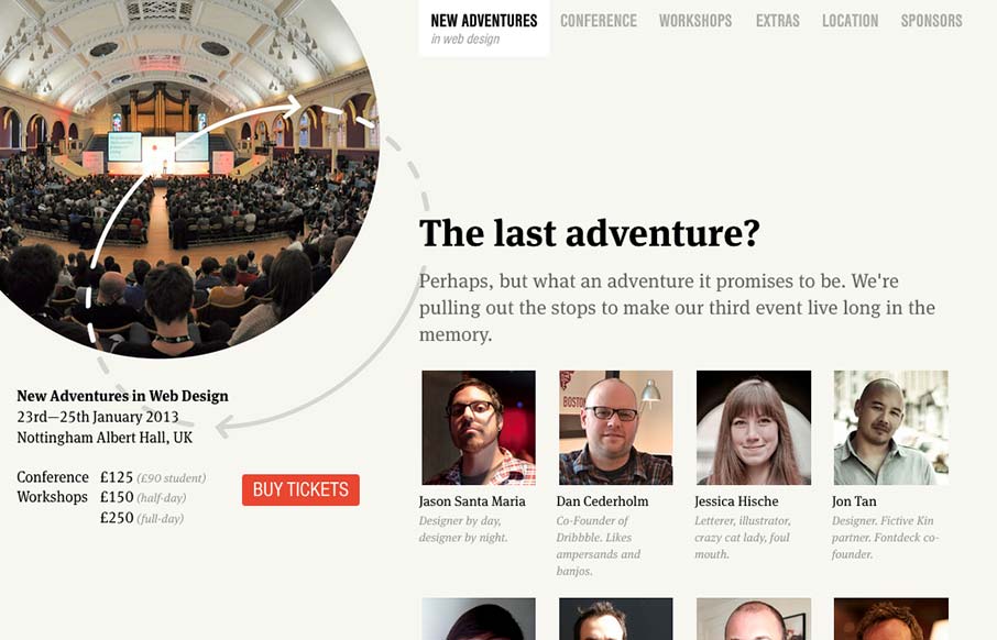
Nice site. I really like the static content on the left. Really, this site is all about selling tickets. It makes sense to keep that button on the page at all times.

I think that the collapsed nav is interesting, though I feel that area of the page has room for a vertical nav instead. At tablet sizes, the select box feels a little small and out of place, but at phone sizes it’s cool.

Love the lineup, as well.

0 Comments

Submit a Comment

Your email address will not be published. Required fields are marked *

News & Articles

Website Scanning Patterns for Maximum Engagement

Website Scanning Patterns for Maximum Engagement

Discover how users visually process websites, the role of scanning patterns, content placement, and “the fold” Learn to design engaging pages with fast-to-consume content that aligns with user behavior.