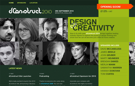
Aside from what looks like a quite awesome conference to attend, the design of the dconstruct 2010 website matches with great design. From the colors to the conceptually matching design elements this site is one of my favorites in a good while. I love the colors and the treatment of the speaker’s photos. That orange on the call to action spot is well chosen. The sub pages are all nicely touched up as well.
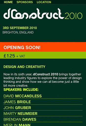
One of the coolest things about this site is that when you size the window down to what would be essentially an iPhone window size you get the below image.

Very smart and classy in the way it’s been executed. This site is chock full of little subtle features and the Clearleft clearly know their audience and haven’t let us down with this wonderful website. Check out our screen cast review of this website too.


That is a solid website, I love that iPhone/Mobile switch it does … trying to work out how they do it, though it might be a different body id or class when the viewport shrinks … no luck. And i don’t even like green. Great work.
Those ClearLeft chaps are top class aren’t they?