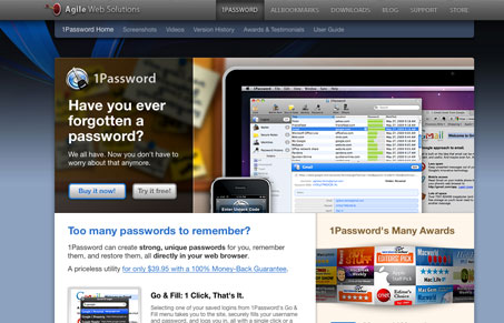
This site is a little tricky, I wanted to feature the page for the 1Password product most of all on their site, I just liked it the most. For the most part the site is designed well, the thing I like most is the main navigation bar/header area. It stays fixed at the top of the page and continues to stay fixed as you scroll, it even stays put as you make your way from section to section on the site, or portal pages or whatever you call them.
Glassmorphism: The Transparent Design Trend That Refuses to Fade
Glassmorphism brings transparency, depth, and light back into modern UI. Learn how this “frosted glass” design trend enhances hierarchy, focus, and atmosphere, plus how to implement it in CSS responsibly.


Thanks! I’m glad you like the new site design. We’re always looking for ways to improve, so I’d love to hear any suggestions you have.
Cheers!
–Dave Teare
Co-author of 1Password