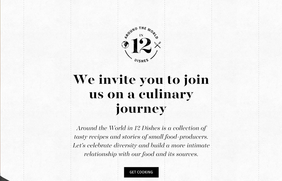
I’m in love with the way this website does sectional targeting. You start off with sort of a splash page (we can discuss that later) then get siphoned off into a couple different directions depending on your food choices. Then there’s a solid landing page for each one that keeps you interested with it’s content and interaction design. Solid work here for 12 Dishes.
Glassmorphism: The Transparent Design Trend That Refuses to Fade
Glassmorphism brings transparency, depth, and light back into modern UI. Learn how this “frosted glass” design trend enhances hierarchy, focus, and atmosphere, plus how to implement it in CSS responsibly.


0 Comments